Posts

Showing posts from January, 2024

Planning: Storyboard

Image
  This is the storyboard for our opening sequence. Nothing is quite set in stone yet, but this is the foundation I will work off of to plan out and strategize the production of our opening sequence.

Planning: Location, Participants, Health, and Schedule

Image
  The   participants   in our film will be: Enzo Prieto Joao Nunes Constanza Cirgliano Nick Zilberstajen Location:  Some of us live at great distances from each other making it slightly challenging to find a point to collectively meet and film. But we decided to use a local state park Oleta state park.  For the scenes in the car we decided to use some of our school friends' cars and to use roads near patches of woods to add the immersion in the opening sequence. The scenes in the driveway could take place either at Joao's or Constanza's residence. Schedule: By 2/20 we will film our scenes in the driveway which should take no more than one day. By 2/27 we will film our on the road scenes which should also take no more than one day. By 3/5-8 we will film our scenes in the woods which could take various days to film and set up After this we will use the next following weeks to complete editing, plan for the CCR and finally submit both our opening sequence and our Critical Refl

Planning: Title Design

Image
  We have been contemplating the use of various different types of fonts and there colors and which would be most effective for our film and genre. The opening credits I came up with for my film will have titles typed in a creepy serif font very similar to that was used in stranger things. This font is shown in the image all the way at the bottom of this blog. For the placement of our titles I was thinking about putting the director, main title and production studio at the center of the screen and all the other names would be sprinkled in either the bottom left or bottom right corner throughout the opening sequence. I planned on making the titles a  gross red maybe even darker than what I'm using at the moment.  I would have the titles slowly animated onto the scene letter by letter to add dramatic effect and the director's title would be paired with a pause or end of the music to highlight their importance, most likely towards the end before the main title, these animations wo

Planning: Script

Image
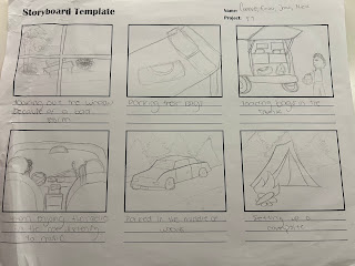
   Characters: Edward-Eddie (Enzo) Carlos (Joao) Milana (Connie) The Monster (Nick Z.) Scene 1: (strong wind in the background) (looking through window of house) Edward: Rough day out huh? Carlos: Yeah I'm not sure if our tents will stay up. Milana: Seems like a huge storm is brushing through. I don't know how I feel about this road trip anymore. Edward: We'll be fine it'll pass in a day or two, and its winter break loosen up a little we only have a few days left till we're back on that awful campus. Carlos: Whatever you say man. Scene 2: (Low volume country music starts playing) (Carlos and Edward are hauling heavy bags into the trunk of a car) Carlos: (Loud Grunt) (Slams bag into trunk) Jesus are you sure we need all this stuff looks like a bit much for a 3 to 4 day road trip Edward: Yes dude we need a campfire, food, clothes, our sleeping bags and the drinks. Scene 3: (Music Intensifies) (Cuts to the three enjoying themselves in the car singing music) (No dialogu

Title Research: The Final Decision (2009)

Image
   The Final destination's opening sequence provides a different twist in the order in which titles are shown in the opening sequence of the film. The film's opening sequence begins by introducing the title of the film rather than having it put towards the end. They then go through a series of various animations to display the studios, directors, supervisors, and film companies. The titles are written in a bold white font to stand out from the darkish green background and the names are separated using thick white lines. The film's opening sequence presents some unsettling images throughout the opening sequence. These images include x-rays of skulls being sliced in half, with their teeth or jaws busted or split open. They also show bright ropes of barbed wire and string strangling the x-rays. They also emphasize an ambulance blowing up alongside a bunch of tools floating in the background. The film does the best at setting the thriller genre with its opening sequence compare

Title Research: Manhunt

Image
   In the film Manhunt they have various titles displayed throughout the opening sequence. These titles include the studio, production company, director and inspiration for the film. The titles also include where the film is taking place. The last title to be shown is the title of the movie itself and then the background changes to a very bright red emphasizing the film title apart from the rest. The images emphasized during the opening sequence are that of terrorists which sets the concept of the movie up and gives the audience an understanding of what they're about to watch. They also show documents that appear to be federal or secretive in the background with more mugshots of terrorist with lines connecting all of the mugshots and documents. The film establishes the thriller genre with the use of a serious and off-putting font. The faded effect on the font also adds on to the immersion of the audience and the use of ominous and exhilarating music. The animation of the title &quo

Title Research: Twister

Image
   In the film twister there is a minimal amount of titles presented during the title scene they display the Warner Brothers logo and the studio its produced by with no mentions to the directors or any of the cast and the last title displayed is the title of the movie itself. The images prioritized during the title sequence is the background where the title is displayed. In the background there are thick storm clouds covering the entire screen. These storm clouds are dark and have lightning bolts and flashes showing a thick and heavy storm. There was also debris flying all around the screen showing the impact of a tornado. The film twister sets the genre by using thick black font getting swiped and thrown away by the wind with intense music similar to that in action movies. These conventions are very common amongst thriller movies aiming to create a sense of fear and adrenaline in the audience. I aim to use the font animations in my film to make the film appear scarier and more ominous

Title Research: Watch the Titles Website

Image
  Welcome back bloggers! Its time to continue the next step of our opening sequence. This is looking up and researching other films of similar genres to see what techniques and conventions they utilize to set the tone for their audiences. To do this I had to use a reliable website that made researching these titles as simple and efficient as possible. The website I will be using to research various title designs is watchthetitles.com. I found this website to be the most efficient due to its variety in film options and its ability to research various studios and designers. The website was also extremely simple to utilize and look at short title sequences of some of the most popular films such as Se7en. The website also organizes and categorizes its film making it simple to find exactly the tiles we are looking to study. This ranges from tv shows to feature films to block busters to video games and event films each having a plethora of title sequences to analyze and take inspiration from